http://www.cliohealthcare.com/ _ the clio awards for healthcare
Recent Updates Page 24 Toggle Comment Threads | Keyboard Shortcuts
-
Bobby
-
Bobby
Another great responsive site. http://www.greygoose.com
-
Bobby
jmpress.js | a jQuery plugin to build a website on the infinite canvas
a jQuery plugin that’s an homage to prezi using canvas and css3, in modern browsers
jmpress.js | a jQuery plugin to build a website on the infinite canvas.
-
Bobby
well that solves the flash issue!!!!
-
-
Bobby
-
Bobby
-
greg
very cool
-
-
Bobby
-
Bobby
Dieter Rams’ 10 principles of good web design | Feature | .net magazine.
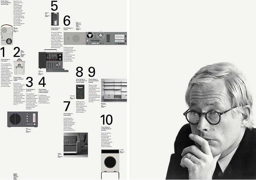
1. Good design is innovative
2. Good design makes a product useful
3. Good design is aesthetic
4. Good design makes a product easy to understand
5. Good design is unobtrusive
6. Good design is honest
7. Good design is long-lasting
8. Good design is thorough
9. Good design is environmentally friendly
10. Good design is as little design as possible
-
Bobby
http://slaveryfootprint.org/ – a really fun way to fill out a form!
-
Bobby
-
roussel
Mac Safari is about the same at 62%
-
Bobby
firefox 10 just updated… only a 60%
do i dare ask how IE is?
-
-
greg
FF 9 on PC == 43%
IE 8 on PC… never loaded at all…
Chrome 16 == 62% -
roussel
IE9 on WIndows 7 = 39%
-
-
greg
Most companies approach standards from a branding perspective. Some may even approach them from an interface design perspective. But there’s more to creating standards, especially for mobile devices. . Mobile platforms differ from traditional computing, for which you can make certain assumptions about the work being performed and the people performing it. And modern mobile devices are different from the phones of the past with T-9 typing and text-based layouts that limited the breadth and variety of interactions you could design.
Mobile is amazingly versatile, and design for mobile is about the culture of your audience, the tasks they are trying to complete, and the context in which they are completing them. Design for mobile and therefore mobile standards need to be approached from a human perspective. The primary purpose of mobile standards is the same as if they were created for a more traditional interface. From a business perspective, they are created for two reasons:
- Standards save time and money by avoiding duplication of effort by developers and designers across projects and interfaces.
- Standards enable the creation of interfaces that are efficient and familiar to users, thereby increasing usability and decreasing the learning curve.
These two benefits should be fulfilled in any guidelines documentation. But with the advent of standardization of mobile interfaces, there are so many other ways guidelines can be expanded to serve the audiences they affect: the developers and designers who implement solutions based on the standards, and the end-users of the products being created.
Read the rest of the article: Raising the Bar for Mobile Standards @ UX Magazine.
-
greg
Using the HTML5 Geolocation API » SitePoint
Knowing the location of your users can help boost the quality of your website and the speed of your service.
In the past, users had to actively input their location and submit it to a site, either by typing it, using a long drop-down list, or clicking a map. Now, with the HTML5 Geolocation API, finding your users (with their permission) is easier than ever.

Read up the geloaction HTML5 API at Using the HTML5 Geolocation API » SitePoint.
-
Bobby
Sh*t Web Designers Say
I swear I think I’ve said all of these.. except the Kelly Clarkson thing. She sucks.
-
scatalina
love it
-
greg
no way… not enough Macs in that vid
-
-
Bobby
Chevy pushes YouTube above and beyond for the Superbowl
This page will only be like this for a while (till Sunday I imagine) so head out to check it out.
Looks like YouTube is finally letting brands take over more of the real estate on their channels. This is a great example of how to utilize the space.
-
roussel
They came out with the new look in early December and are rolling out new designs and functionality with their CosmicPanda updates ( http://www.youtube.com/cosmicpanda )
I added a folder with a few layout option PSDs onto PITFP02/Team_Folders/Interactive Services/Design Library/YouTube layouts Dec 2011 – Jan 2012
-
-
Bobby
http://adage.com/article/digital/facebook-files-ipo-reveals-1-billion-2011-profit/232484/?utm_source=daily_email&utm_medium=newsletter&utm_campaign=adage I found this article about Facebook pretty interesting – thought I’d share
-
Bobby
How to get consistent color output and avoid the dreaded PS color shifts
Color shifts in web design graphic outputs are probably a much worse problem that one might imagine. I’ve recently tackled this issue at work and wanted to share my findings.
My set up at work is as follows:
- MAC Book Pro running Lion
- Dual Screen monitors using the laptop screen and an awesome Dell U2410 monitor.
- Adobe CS5
This all started when my work machine was upgraded to Lion OS. After this, all of my settings within CS5 and my color calibrations thru my monitor were out of whack.
I was noticing odd things like the color of images pulled from the web looked different in Photoshop. A LOT DIFFERENT. Well here is how I fixed it and I would recommend everyone doing this same thing (especially those I work with) so that we are all producing graphic files that have the same color profile information.
First, make sure your monitor (if not using the MAC laptop screen) is set to sRGB. To do this:
FOR MACS
1.Go to the Apple > System Preferences > Display (to make sure you’re on the correct screen if using dual screens) > Color (make sure you’re editing the secondary/main screen)
2. In the color settings of the monitor in question scroll to the bottom and select “sRGB IEC61966-2.1”. sRGB is the industry standard color calibration for the web.That should get you using the proper color profile on your monitor. If you’re using just the laptop screen, you’ll probably find that the only color profile available is the Color LCD profile which is fine.Next you need to go into CS5 programs and set up your color settings:
1. Open Photoshop (these instructions work for illustrator also) and without a file open go to EDIT > Color Settings…
2. in the Color Setting dialogue box, change the WORKING SPACE RGB to Monitor RGB. This will force photoshop to match the color on your monitor (which is now sRGB).
3. in the Color Settings dialogue box make sure the “ask when opening” box is UNchecked. See the graphic below.

4. Close Color Settings
5. Now in Photoshop, Under “VIEW” make sure your PROOF SETUP is > Monitor RGB

6. Go back into “VIEW” and make sure “PROOF COLORS” is UNchecked.Last but not least. SAVING the images out for the web.
One more thing to make sure you DON’T do. When saving a file with ‘Save for Web’ make sure you uncheck the CONVERT TO sRGB box. Mainly because if done correctly your file should already be using that profile.
If you follow the simple steps above we should ALL be producing the same colors in everything we do.
-
Bobby
How Superbowl Ads are tying into mobile, QR codes, mobile apps, Facebook, twitter…
The Associated Press: Super Bowl advertisers go after “second screens”.
-
Bobby
Over 40 Free Vector Ribbons for Great Looking Designs
Over 40 Free Vector Ribbons for Great Looking Designs.
The latest design trend. RIBBONS!

-
Bobby
How to Approach a Responsive Design | Upstatement.
A must read:
So we lined up the usual suspects from Adobe. Who would be our partner in crime — Photoshop? Illustrator? InDesign?

Hands down, the answer was InDesign. At its core, BostonGlobe.com is a publication website, and InDesign is the best tool for laying out publications and content. Yes, there are huge differences between designing print publications and designing for the web, but consider this: Most web pages are simply a combination of photos and text. And where Photoshop excels at manipulating images (but sucks at type) and Illustrator is exceptional at typography (but sucks with images), InDesign is built for both……
-
greg
Responsive Web Design Primer
SitePoint posted a nice Responsive primer, although more technical in nature… its still a quick, easy read.
-
Bobby
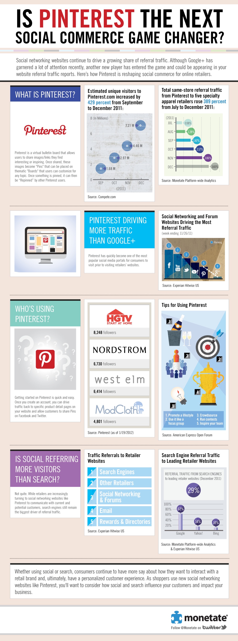
Pinterest Becomes Top Traffic Driver for Retailers [INFOGRAPHIC]
Pinterest Becomes Top Traffic Driver for Retailers [INFOGRAPHIC].
 greg is discussing.

 roussel,
 scatalina are discussing.
Reply
You must be logged in to post a comment.