Which test should you use?

AB_Usability_Infographic_Final.png PNG Image, 1000×1575 pixels – Scaled 60%.
AB_Usability_Infographic_Final.png PNG Image, 1000×1575 pixels – Scaled 60%.
How the Boston Globe Pulled Off HTML5 Responsive Design.
I’ve been searching for a larger “corporate” type site that move to a responsive design and looks like the Boston Globe did it right. Really of any industry to utilize this technology, a newspaper makes a ton of sense.
People want to be able to read the news where ever they are on what ever device they are on. Kudos to Boston Globe for the forward thinking.
Back in the early days of PC computing, we were interested in how people used all those options, controls, and settings that software designers put into their applications. How much do users customize their applications?
We embarked on a little experiment. We asked a ton of people to send us their settings file for Microsoft Word. At the time, MS Word stored all the settings in a file named something like config.ini, so we asked people to locate that file on their hard disk and email it to us. Several hundred folks did just that.
We then wrote a program to analyze the files, counting up how many people had changed the 150+ settings in the applications and which settings they had changed.
What we found was really interesting. Less than 5% of the users we surveyed had changed any settings at all. More than 95% had kept the settings in the exact configuration that the program installed in.
This was particularly curious because some of the program’s defaults were notable. For example, the program had a feature that would automatically save your work as edited a document, to prevent losing anything in case of a system or program failure. In the default settings for the version we analyzed, this feature was disabled. Users had to explicitly turn it on to make it work.
Of course, this mean that 95% of the users were running with autosave turned off. When we interviewed a sample of them, they all told us the same thing: They assumed Microsoft had delivered it turned off for a reason, therefore who were they to set it otherwise. “Microsoft must know what they are doing,” several of the participants told us.
We thought about that and wondered what the rationale was for keeping such an important feature turned off. We thought that maybe they were concerned about people running off floppies or those who had slow or small disks. Autosave does have performance implications, so maybe they were optimizing the behavior for the worst case, assuming that users who had the luxury to use the feature would turn it on.
We had friends in the Microsoft Office group, so we asked them about the choice of delivering the feature disabled. We explained our hypothesis about optimizing for performance. They asked around and told us our hypothesis was incorrect.
It turns out the reason the feature was disabled in that release was not because they had thought about the user’s needs. Instead, it was because a programmer had made a decision to initialize the config.ini file with all zeroes. Making a file filled with zeroes is a quick little program, so that’s what he wrote, assuming that, at some point later, someone would tell him what the “real defaults” should be. Nobody ever got around to telling him.
Since zero in binary means off, the autosave setting, along with a lot of other settings, were automatically disabled. The users’ assumption that Microsoft had given this careful consideration turned out not to be the case.
We also asked our participants for background information, like age and occupation, to see if that made a difference. It didn’t, except one category of people who almost always changed their settings: programmers and designers. They often had changed more than 40% (and some had changed as much as 80%) of the options in the program.
It seems programmers and designers like to customize their environment. Who would’ve guessed? Could that be why they chose their profession?
(Big takeaway: If you’re a programmer or designer, then you’re not like most people. Just because you change your settings in apps you use doesn’t mean that your users will, unless they are also programmers and designers.)
We’ve repeated this experiment in various forms over the years. We’ve found it to be consistently true: users rarely change their settings.
If your application has settings, have you looked to see what your users do? How many have changed them? Are the defaults the optimal choice? Does your settings screen explain the implications of each setting and give your users a good reason for mucking with the defaults?
Horizontal emails inspire strong feelings among designers. Depending which side you come down on, horizontal emails are either cutting edge and artistic or counter-intuitive and pretentious.
Horizontal emails tend to be image based, favored by B2C rather than B2B. The side scrolling layout breaks convention, so navigational cues and intuitive design will determine if your email frustrates or delights.
Here’s twenty-three rare, outside-of-the-box, experimental horizontal emails.
Another great example of responsive web design.
Upcoming Web Design and Development Conferences in 2011-12 – Smashing Magazine.
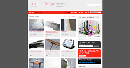
10 excellent blogs about industrial design.
If creatively you’re ever in a rut, I always find Industrial Design to be a great way get inspiration. Here are 10 blogs that focus just on that.
Awesome typography, old skool. http://bibliodyssey.blogspot.com/2011/02/sanborn-fire-insurance-map-typography.html
HTML5 Apps: 10 Cool HTML 5 Web Apps | CreativeFan.
A service called EdgeRank Checker revealed data this week that showed how using a third-party application — like Hootsuite or Tweetdeck — to update your Facebook Page decreases your engagement per fan (on average) by about 70%.
As you can imagine, the data was reported widely, tweeted, shared and taken by many as gospel. This post aims to shed more light on what’s really going on.
The EdgeRank Checker study looked at 1 million status updates on 50,000 pages that influence more than 1 billion fans, and concluded that third-party tools hurt your EdgeRank score.
EdgeRank is Facebook’s algorithm that tries to separate the signal from the noise to present each user with the most interesting content. It uses engagement as a primary factor in its weighting. A post that receives little or no engagement does not get through to the feed. High engagement increases the post’s visibility in users’ feeds and increases the Page’s EdgeRank score. For more on EdgeRank, check out this great post on Econsultancy from last month.
The company behind the data speculated that there are four potential reasons for the lower engagement:
Read more @ Posting to Facebook: Truth About Third Party Applications | Advertising Age.
Very unique idea to promote new business and frame it with a full football seasons worth of relationship building.
Are you ready for some football? Are you ready for some free client services? Then maybe you want to sign up for Young & Laramore’s 2nd Annual Fantasy Client Fantasy Football League. The Indianapolis agency has sent an invitation, along with a copy of ESPN Fantasy Football magazine, to a “select group of ‘fantasy’ client prospects.”
Not among the invited? Don’t worry. The shop has left two open slots.So far, Skullcandy and Late July have signed up. Since this is a relationship-building exercise, Y&L will not only crown the winner, but will interact with all of the contestants throughout the season. According to Tom Denari, agency president, Small Agency Diary blogger, and a fantasy football champ, after an autodraft is complete, an agency employee will be assigned to each marketer. The agency runs its own 24-team league for employees and is in the process of drafting players. UPDATE: See comments for clarification of this.
We attempted to reach out to last year’s winner, but found this on the FAQ page. “Was there a First Annual Fantasy Client Fantasy Football League? No.”
this is hot.. you have to go to the site to see it in action.
The web today is a growing universe of interlinked web pages and web apps, teeming with videos, photos, and interactive content. What the average user doesn’t see is the interplay of web technologies and browsers that makes all this possible.
Over time web technologies have evolved to give web developers the ability to create new generations of useful and immersive web experiences. Today’s web is a result of the ongoing efforts of an open web community that helps define these web technologies, like HTML5, CSS3 and WebGL and ensure that they’re supported in all web browsers.
The color bands in this visualization represent the interaction between web technologies and browsers, which brings to life the many powerful web apps that we use daily.
Interesting article around CPG companies moving more into digital… http://www.dmnews.com/cpg-brands-dive-headfirst-into-digital-sphere/article/210174/
25 Coolest Web Application Interfaces.
Great collection of Web App interfaces.
The Difference Between Design and Art.
Good read and explanation of the differences between the two.

The good and evil of infographics: idsgn (a design blog).
Great article about infographics.
Responsive Web Design and Facebook Fan Pages a Perfect Marriage | Search Engine Journal.
I was thinking about this the other day. Responsive makes perfect sense for yet another size… Facebook pages, or 520px wide.
Reply
You must be logged in to post a comment.