Create a great mobile experience for your website today. Please. – Scott Hanselman
People are fascinating with making mobile web sites. It’s amazing that we’re not impressed with the fact we carry tiny supercomputers in our pockets but we’re amazed when a website looks decent on our phones.
There’s a few directions you can go when going mobile for your site, and the key is finding balance. You can:
- Do nothing. Your site will probably work on a mobile device but each day it will look worse and worse to a discerning public with increasing expectations.
- Use Adaptive/Responsive Design. This is my favorite option. If your site is read-mostly (rather than a data-entry application) you can get a great experience on all devices by adaptively rendering your site based on screen-size. If you’re focused on performance you can add a server-side component and resize image for mobile as well. Visit http://mediaqueri.es for inspiration.
- Use a mobile framework. There’s lots great frameworks like Sencha, Kendo, jQuery Mobile and others. These frameworks can get you near-native looking applications using HTML5 techniques.
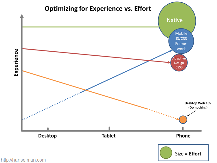
- Write a native app. For the time-being while it’s cool to try to get native experiences using non-native tools, it’s hard. The best native experience on a mobile device will remain a native-built application. This requires the most work with arguably the best experience. However, you CAN get 90-95% of the experience with less than 90% of the effort if you use some of these other techniques. Plus, you’ll anger fewer users by not forcing them to download a crappy mobile app by just making a lovely mobile website.
read the rest at Create a great mobile experience for your website today. Please. – Scott Hanselman.
Bobby 1:19 pm on April 24, 2012 Permalink | Log in to Reply
looks like adaptive / responsive wins again!