A few months ago, Chris Coyier shared his favourite CodePen demos right here on David’s blog. A while back David asked me to share some of my favourite pens too, so here are some of the demos that have blown my mind in the past few months as well.The main thing you’ll notice about my favourite pens is that most of them are done using SVG. SVG’s awesome animation capabilities combined with some really great animation libraries can yield some very impressive effects, as you’ll see.
Updates from greg Toggle Comment Threads | Keyboard Shortcuts
-
greg
-
greg
What WordPress Theme Is That is a free online tool allows you to easily detect what WordPress theme a site uses (including parent and child themes). Additionally, it will also detect what WordPress Plugins are being used.
-
greg
The Three-Click Rule is an unofficial website navigation rule that suggests that users should be able to find any information within a website using no more than three mouse clicks.
Many user experience (UX) professionals believe that users of a site will become frustrated and leave if they cannot find desirable content within the three clicks. Therefore, if a website follows this three-click rule, navigation is more efficient.
Read the whole glorious thing… User Experience Myth Or Truth: The Three-Click (Or Tap) Rule.
-
greg
Nice collection of IFTTT tactics for automating the socials and such…
Social Media Automation :: Best IFTTT Recipes for Social Media Managers.
-
greg
“Can I use” provides up-to-date browser support tables for support of front-end web technologies on desktop and mobile web browsers.
-
greg
Sass for WordPress Developers
There are many benefits of Sass for WordPress developers. You’ve probably heard many arguments for using a pre-processor by now. CSS pre-processors provide the opportunity for better code organization by using partials and nesting styles. Pre-processors help developers style faster by writing mixins and functions. Pre-processors also allow us to write more maintainable, scalable code with logic and variables.
read all about it @ Sass for WordPress Developers.
-
greg
How do you identify a browser bug?
Your new site is not behaving how you’d expect – but how do you know if the bug is hidden in your code, or if it’s a browser issue? Creative Bloq asked the experts.
Check out How do you identify a browser bug?
-
greg
Unleash the Power of the WordPress Shortcode API
WordPress introduced the Shortcode API in its version 2.5. This API allows developers to add some more or less complex features in their plugins or themes without the user having to insert any HTML code.
The advantage of the Shortcode API is that developers do not need to use regular expressions to detect if the user included their shortcodes into their posts: WordPress automatically detects the registered shortcodes.
In this tutorial, we will learn how to use the Shortcode API. We will create our own shortcodes, see how to use classic and unnamed attributes and also how to handle content.
Get ready to …. Unleash the Power of the WordPress Shortcode API.
-
greg
Using Sass to Build a Custom Type Scale with Vertical Rhythm
One way to achieve visual consistency in web design is to use a vertical rhythm. For a website, this would mean that no matter what font-size any text element is, its line-height is always an even multiple of a consistent unit of rhythm. When this is done precisely, you could put a striped background behind your page and each text block (paragraphs, headings, blockquotes, etc) would line up along the lines in that grid.
As you could imagine, setting this up by hand would require a lot of math and typing. If you want to change the proportions of that grid responsively, you’ll redo that work for every breakpoint. Sass, as you might expect, provides a great toolbox to automate all that work and generate a custom type scale with consistent vertical rhythm more easily.
I’ll start off by admitting that there are already some good Sass plugins that help build a custom type scale with consistent vertical rhythm. If you’re just looking to grab a pre-built chunk of code, try Typesetting, Typomatic, or Typecsset.
This one is really good. Took a little time to read through – as i’m not a super trained high-skill “artist” who wears a beret.
check out – Using Sass to Build a Custom Type Scale with Vertical Rhythm.
-
greg
Checking Media Queries With Javascript
With the web being used on so many different devices now it’s very important that you can change your design to fit on different screen sizes. The best way of changing your display depending on screen size is to use media queries to find out the size viewport of the screen and allowing you to change the design depending on what screen size is on.
read the whole article at Checking Media Queries With Javascript.
personally, i think this is possibly an excellent way to inject only the needed javascript libraries according to their usefulness. If a particular feature ability isnt used in a certain context, say a Revolution Slider in desktop which isn’t used in tablet or mobile… don’t load that library unless you have to!
-
greg
UX designer Curt Alredge wanted to test if the assertion made by Aubrey Johnson was true:
Hollow icons create more work for users and ultimately create cognitive fatigue
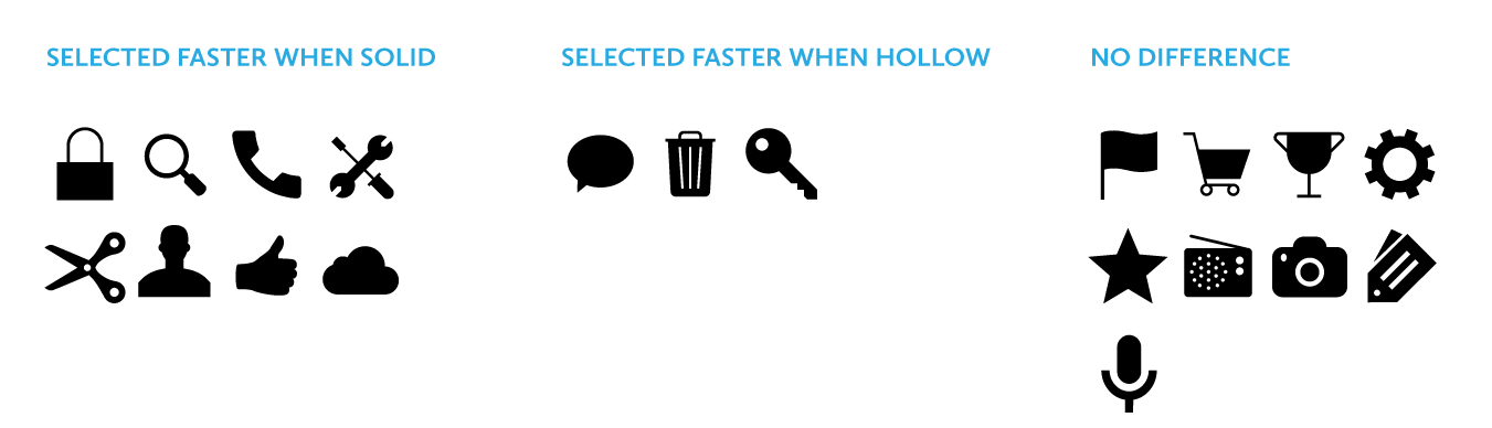
Icon Recognition Test is a web app game that will test your skills in identifying hollow and non-hollow icons.
Research has shown that users begin to map the meaning of icons to their positions in the interface – was a line from Alredge’s article which I agree with mostly, especially as I took the test. If an icon appeared nearby an item I was looking for, I would tend to look for the next icon in search near there. If it was close by, quicker correct answer.
-
greg
There are many stock art sites out there, from larger companies where illustrations is only part of their offering, to smaller sites focusing purely on illustrators – anything from a tiny handful to a more extensive roster.
Check out this list of some of the best and most popular sites for you to check out.
The 13 best places to download stock art online from Creative Bloq
-
greg
Is space above the fold still valuable in 2014?
At the end of 2013, Peep Laja spoke at SearchLove about the Principles of Persuasive Web Design. He had observed that despite it being 2013 (now 2014) and us living in a much more scroll-oriented world, content placed above the fold was still grabbing 80% of our attention.

read up – Life Above and Beyond the Fold – Moz.
-
greg
Curated resources for everything design related
oozled brings together 534 curated resources in 41 categories.
check out oozled.
-
greg
Responsive Email Design | Campaign Monitor
If you read your email regularly using an Internet-enabled phone, you probably know that it’s an experience that can swing from awesome to awful. While an email newsletter can look superb in the inbox, when squeezed onto a small screen, it can become absolutely unusable, with small fonts, narrow columns and broken layouts being common issues.
In this guide, we’ll look at why designing for mobile has become a necessary skill for email designers, cover the fundamentals of designing and building a mobile-friendly email and back it all up with some neat tips and techniques. We’ll assume you know a little about coding HTML for email, but if not, we’ve also got a couple of great guides to get you started.
-
greg

There isn’t just one way to animate SVG. There is the
<animate>tag that goes right into the SVG code. There are libraries that help with it like Snap.svg or SVG.js. We’re going to look at another way: using inline SVG (SVG code right inside HTML) and animating the parts right through CSS.read all about it Animating SVG with CSS | CSS-Tricks.
-
greg
SO…
Seriously – extremely useful tool. I absolutely used this tool today to determine what platform a client site was built with…
-
greg
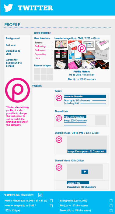
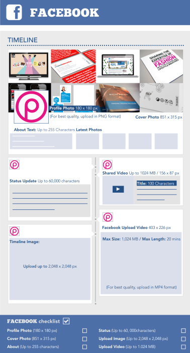
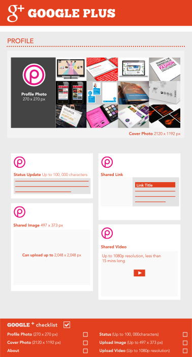
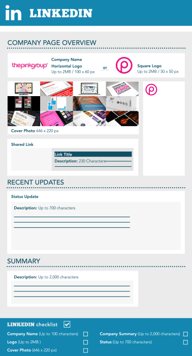
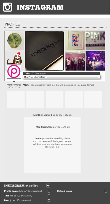
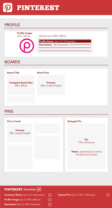
You know the situation, you’ve got a new logo or image you want to use across your social media and the next hour is taken up Googling what size each image needs to be, how big the file should be and how many different options you need. Well now you can use that hour to sit back and relax. We’ve done all this hard work for you and put together our awesome social media cheat sheet just for you! via Social media cheat sheet (2014) – super speedy, all you needy | The Pink Group.
-
greg
jQuery is a fantastic library for designing and developing user interactions quickly. Whether it’s an image gallery or form, content-revealing animation or an explosion effect, the library provides the core building-blocks to allow you to rapidly prototype and deliver a unique user interface with the minimum of code and effort.
This presents an interesting question, however. Just because you can roll your own solution to any given problem, does that mean you should? Of course not! There’s absolutely no need to reinvent the wheel every time you want to create a bit of common functionality; use plugins to instantly add a behaviour. Doing so will save you even more time and effort! Here’s a nice new list.
-
greg
Reply
You must be logged in to post a comment.