Razorfish Outlook Report Vol 10
Razorfish Outlook Report Vol 10.
Always a quality MUST READ… Razorfish Outlook Report v10.

Razorfish Outlook Report Vol 10.
Always a quality MUST READ… Razorfish Outlook Report v10.
Please resize me – A brief history of fluidity – Rudy Rigot & Sophie Taboni.
For those of you who are too young to remember what it was like back in the days of the beginning of all this awesomeness we call the interwebs, this is for you.
Brilliant yet simple way to show the history of web page fluidity.
The ISO 9241 standard defines website usability as the “effectiveness, efficiency and satisfaction with which specified users achieve specified goals in particular environments.” When using a website, users have a particular goal. If designed well, the website will meet that goal and align it with the goals of the organization behind the website. Standing between the user’s goal and the organization’s goals is very often a form, because, despite the advances in human-computer interaction, forms remain the predominant form of interaction for users on the Web. In fact, forms are often considered to be the last and most important stage of the journey to the completion of goals.
check out the full Extensive Guide To Web Form Usability @ Smashing UX Design.
Live Augmented Reality for National Geographic / UPC on Vimeo on Vimeo
via Live Augmented Reality for National Geographic / UPC on Vimeo.
How to do AG right.
The numbers quoted make it apparent that having a social strategy in place more often than not will help your brand.
HTML5 dumps TIME element – Jeffrey Zeldman Presents The Daily Report.
This is one of those WTF moments eh?
“It’s with great sadness that I inform you that the HTML5 <time> element has been dropped, and replaced by a more generic – and thus less useful – <data> element. The pubdate attribute has been dropped completely, so there is now no simple way to indicate the publication date of a work.”
Much more at Bruce Lawson’s personal site. Hat tip: Stuntbox.
An article published in Science Magazine in June provides evidence that the Internet has become an “external part” of our memory systems. Rather than remembering information, we seem to have “outsourced” this effortful task to an entity other than ourselves.
On the face of it, this is not an astounding finding in that psychologists have demonstrated for over 30 years that we use outside sources, such as family or team members, to supplement our less-than-perfect memories. What makes this research remarkable, and of interest to the UX community, is that the researchers found that when we expect to be able to access information in the future, we tend to have reduced memory for the actual information, but enhanced memory for where to find the information. Thus, while we do measurably worse at remembering that the capital of Vermont is Montpellier, we apparently remember with greater accuracy, where on the bookshelf the atlas is located. These findings suggest that making sites memorable as the repository of information may be the key to gaining return visitors.
There are some excellent points further into the article that speak to single purpose sites and credibility.
read more @ Metamemory and the User Experience | UX Magazine.
The Lazy IA’s Guide to Making Sitemaps – Boxes and Arrows: The design behind the design.
A good read for the IA’s out there:
This article includes step-by-step instructions on how to make sitemaps with:
1. Excel and Visio 2000 or Visio 2003 (Windows only)
2. Word and Inspiration (Mac OS and Windows)
Use these lazy techniques and spend your time on better and more interesting problems than lining up little boxes!
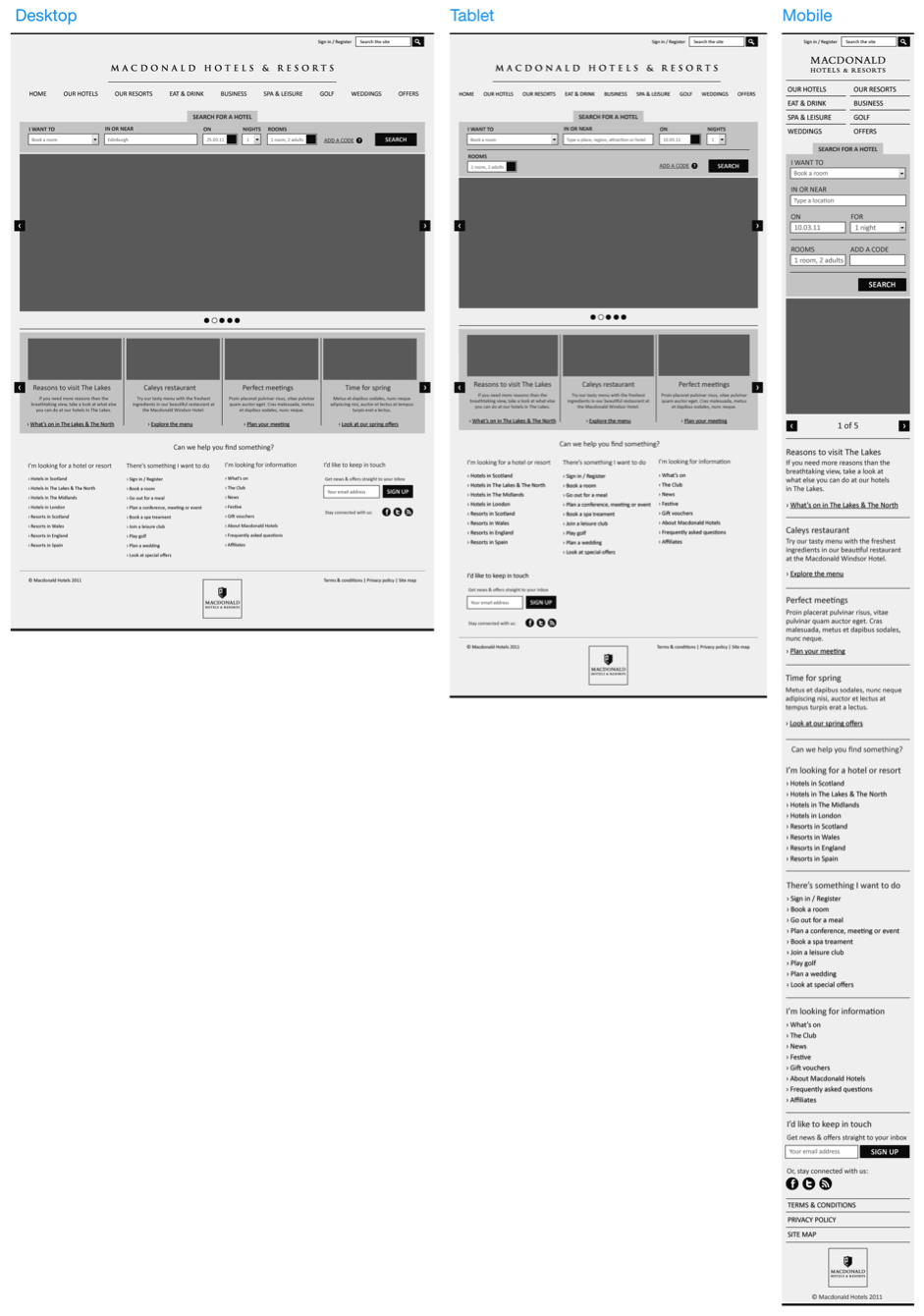
25 jQuery Plugins to help with Responsive Layouts.
The most popular topic of discussion at the moment is undoubtedly responsive layouts in web design. Without going discussing too much what you will already know, a responsive layout allows you to offer a specific and optimised screen size based on whatever device (mobile, tablet…) the visitor uses.
Infographic: The Most Valuable Digital Consumers (Social, Local, Mobile) http://blog.nielsen.com/nielsenwire/online_mobile/infographic-the-most-valuable-digital-consumers/
How to Design a Mobile Responsive Website | UX Booth.
Great article about HOW to design a Responsive Website.
To build a mobile site or not to build a mobile site; this is a question at the forefront of many a discussion. There is, however, another option: responsive web design. When, why, and how should you go about designing a responsive website?
100 Creative Car Campaigns – From Grumpy Grandma Car Ads to Socially Awkward Auto Ads (CLUSTER).
If you have about 4 hours to burn watching Car TV Campaigns, check this out. It’s actually a great collection of car advertising. Worth a share.
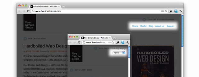
Recent / iOS UI Patterns beta.
AWESOME. UI Patterns for iOS. This will come in very handy yo.
130+ Latest Website Designs For Inspiration | Inspiration | Graphic Design Junction.
There are some great examples in here…
In user interface design, a modal window is a child window that requires users to interact with it before they can return to operating the parent application, thus preventing the workflow on the application main window. Modal windows are often called heavy windows or modal dialogs because the window is often used to display a dialog box.
Modal windows are commonly used in GUI systems to command user awareness and to display emergency states. On the Web, they are often used to show images in detail.
Frequent uses of modal windows include:
check out a nice set of modals @ Modal Windows In Modern Web Design – Smashing Magazine.
Responsive web design term is related to the concept of developing a website design in a manner, that helps the lay out to get changed according to the user’s computer screen resolution. To say more precisely, the designing the concepts enables the users to avail an advanced 4 column lay out, with the width of 1292 pixels, on a 1025 pixel width screen, that auto simplifies into 2 columns. Also it suitably fixes on the screen of smartphone and computer tablets. This particular designing technique is termed as “responsive web designing”.
Responsive web designing is a completely different designing version than the traditional web designing, and developers especially fresher must know about the pros and cons of responsive web designing. This blog is a mighty approach to reveal a few facts about the uses of responsive web designing. Your basic designing ideas will insist you to choose media queries to develop responsive designing site. However, the hassle that you face while using the media queries is, every moment a new queries pops up, your first designing style starts to change from the old one within a very short gap of time. What experts suggest is to use some CSS transitions to ease the jump.
check out the complete list @ Responsive Web Design: 50 Examples and Best Practices – DesignModo.
FlexSlider – The Best Responsive jQuery Slider.
A fully responsive jQuery slider plugin = Awesome.


Reply
You must be logged in to post a comment.