Making of: People Magazines Responsive Mobile Website Global Moxie
Making of: People Magazines Responsive Mobile Website Global Moxie.
A really good read about how a HUGE project went for Global Moxie.
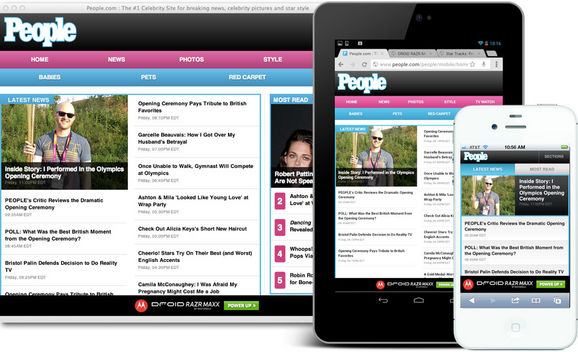
Our brief was to design a responsive site for phones and 7” tablets (Kindle Fire, Nexus 7, etc.). People has two other sites: one for desktop and one for iPad. The new edition stakes out the smaller end of the spectrum, replacing a very simple site that has served phones for several years. The new site’s responsive web design adapts to three primary breakpoints: the phone, 7” portrait, and 7” landscape.
The irony for this “small-screen” website is that its 7” landscape layout is nearly as wide as People’s desktop design. In creating this small-screen design, in other words, we also created a desktop-sized design, too. This is the essential nature of responsive design, of course, a layout that adapts gracefully to a wide range of screen sizes.
Reply
You must be logged in to post a comment.