Why the Flat Design Trend is Hurting Usability.. or is it?
An older article about Why the Flat Design Trend is Hurting Usability, got me thinking about this subject again.
I agree with some of what the article is saying, though I feel saying flat design is hurting usability is a bold statement. I would say instead that designers use of flat design can sometimes be taken too far. When this happens the whole reason to use “flat” as a design technique can backfire and will created the opposite visual advantages, making the design harder for someone to use.
I’ve written about this before, but I believe the answer lies somewhere in the middle of skeuomorphism and flat.
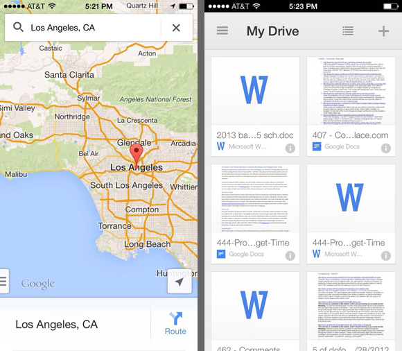
Google does a great job of this I believe. They have flat looking designs but when needed aren’t afraid to use a drop shadows, gradients and strokes for depth and separation of objects.
I personally feel this technique isn’t skeuomorphic nor is it 100% flat. I’ve ran into more instances where a slight separation is needed to make something stand out of a design or separate it from another element.
As a designer it’s my job to make solve a problem for a user. If the solution is a slight gradient on a button to make it look like something that is active and requires action, then there is NO harm in doing so and if done well, doesn’t date the design or make it look non-modern.
B
Reply
You must be logged in to post a comment.