Responsive Design’s Dirty Little Secret | Palantir.net
Food for thought:
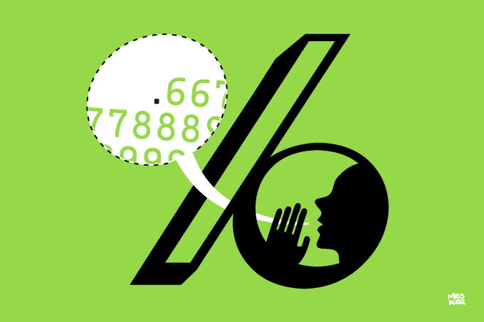
The truth is that fluid grids are broken. Well… perhaps just cracked a bit. Responsive Web design, as Ethan Marcotte defines it, is simply a fluid grid, fluid images and media queries. But fluid grids have a dirty little secret: rounding errors. As we lay out our columns in percentages, browsers have to translate that into actual device pixels to fit in the viewport. And Chrome, Safari, other WebKit browsers, Opera, and the usual suspects (IE 6 and 7) all produce “errors”.
While as a designer and not a developer I don’t quite understand what the big issue is here (and neither does @rwd aka Ethan Marcotte) it’s still a good thing to think about. Responsive Design isn’t perfect yet, and it seems yet again we’re going to have to wait for the browsers to catch up.
Responsive Design’s Dirty Little Secret | Palantir.net.
Reply
You must be logged in to post a comment.