Responsive background images with fixed or fluid aspect ratios
Responsive background images with fixed or fluid aspect ratios – Voormedia.
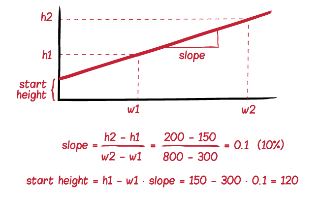
What’s the easiest way to scale background images in responsive layouts? We use an old technique and enhance it to fluidly change the aspect ratio of background images.
Responsive layouts make it possible to dynamically scale the width of a website to fit on small mobile devices as well as larger desktop computers. An element with a percentual width will have its height automatically adjusted. Its aspect ratio remains the same when it is resized.
If we want to accomplish the same with background images we must figure out how to maintain the aspect ratio of any HTML element.

Reply
You must be logged in to post a comment.