Mobile Web: Designing With An Accurate Size And Pixel Ratio – Blog | Übermind
A MUST read for any mobile designer out there.
via Mobile Web: Designing With An Accurate Size And Pixel Ratio – Blog | Übermind.
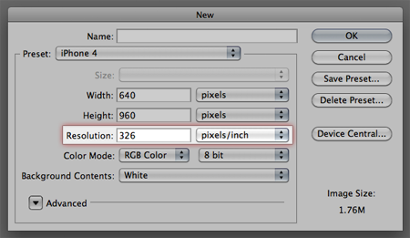
The culprit is your dear friend: the pixel. When high-definition displays became popular, the pixel transformed into a relative unit. The iPhone 3GS could display 165 pixels in every square inch of it’s screen; the iPhone 4’s retina display crammed twice as many pixels into the same space. This is usually referred to as pixel density, or PPI (pixels per inch). A display with a higher PPI will be sharper and support a higher screen resolution, similar to prints with a higher DPI.
This is where the headaches usually begin. Mobile devices tend to have a much higher PPI than most laptop screens or monitors do, so they can display high-resolution objects in a smaller space. An 800×600 image on an old CRT monitor would take up the entire screen; that same image on an iPhone 4 won’t even fill the viewport in landscape mode. Even if your monitor supports an extremely high resolution, a default 2×3″ canvas will rarely be 2×3″ physical inches.
Reply
You must be logged in to post a comment.