Found this excellent site today. I signed up for updates – it’s that fresh.
Try Transitions instead of showing changes instantly.
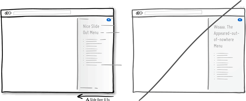
Interface elements often appear, hide, move, shift, and resize as users do their thing. As elements respond to our interactions, it sometimes is a little easier to comprehend what just happened when we sprinkle in the element of time. A built in intentional delay in the form of an animation or transition, respects cognition and gives people the required time to understand a change in size or position. Keep in mind of course that as we start increasing the duration of such transitions beyond 0.5 seconds, there will be situations where people might start feeling the pain. For those who just wish to get things done quickly, too long of a delay of course can be a burden.
Just a growing list of common UI practices to get the best possible design. Lots of great ideas @ GoodUI.
Bobby 1:47 pm on January 21, 2014 Permalink | Log in to Reply
pretty sure i posted this about 6 months ago… BOOM!