Focal Point: Intelligent Cropping of Responsive Images | Design Shack
This sounds pretty awesome and something we’ll have to take into account moving forward with RWD.
The practice of implementing responsive images is still in its infancy. We’ve seen a lot of ideas and suggestions for how it should be done and we’re bound to see a lot more.
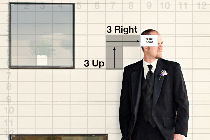
Today we’re going to look at a fascinating little framework that allows you to not only automatically resize your images when the viewport changes, but also crop the images with a specific important focal point in mind. Amazingly enough, it does all this with pure CSS. Read on to see how it works.
Read it all here:
Focal Point: Intelligent Cropping of Responsive Images | Design Shack.
Reply
You must be logged in to post a comment.